Brace

Launching a new Disruptor Brand

Overview

Brace Underwriting Limited are Lloyd’s backed Risk Underwriting Experts with a combined experience of 137 years. Formed from a need for bespoke solutions for underwriting risk, to meet a rising demand for tailored insurance products. Brace provide strength through structural support, innovating new products and drawing on the latest technology and deep data to guide their clients to success.

Brace came to us as a start-up looking to establish themselves in the already crowded London insurance market. We were tasked with identifying their USP and proposition to help them develop their brand. Then to establish a brand that reflects their edge and a different approach to their competition. Whilst still presenting as a professional and high-class organisation and appeal to their high-level American clients.

Services

  • Brand Strategy & Experience
  • Identity Design
  • Web Development

Kicking off with a discovery session with Brace’s founder, Adam Holberry, we discussed what drove Adam to leave the multinational enterprise he had been working for to discover the reasoning behind setting up the new business.

We learned about how Adam himself had grown frustrated with the inefficiencies and saw a gap in the market. Instead of taking the ‘one size fits all’ approach to underwriting risk – Adam and his team develop custom approaches around their clients and their specific risk regardless of size. From this the proposition was shaped to lead the rest for the brand development – ‘Founded by London Underwriting Experts with a combined experience of 137 years, Brace was born from a need for bespoke solutions for underwriting risk.’

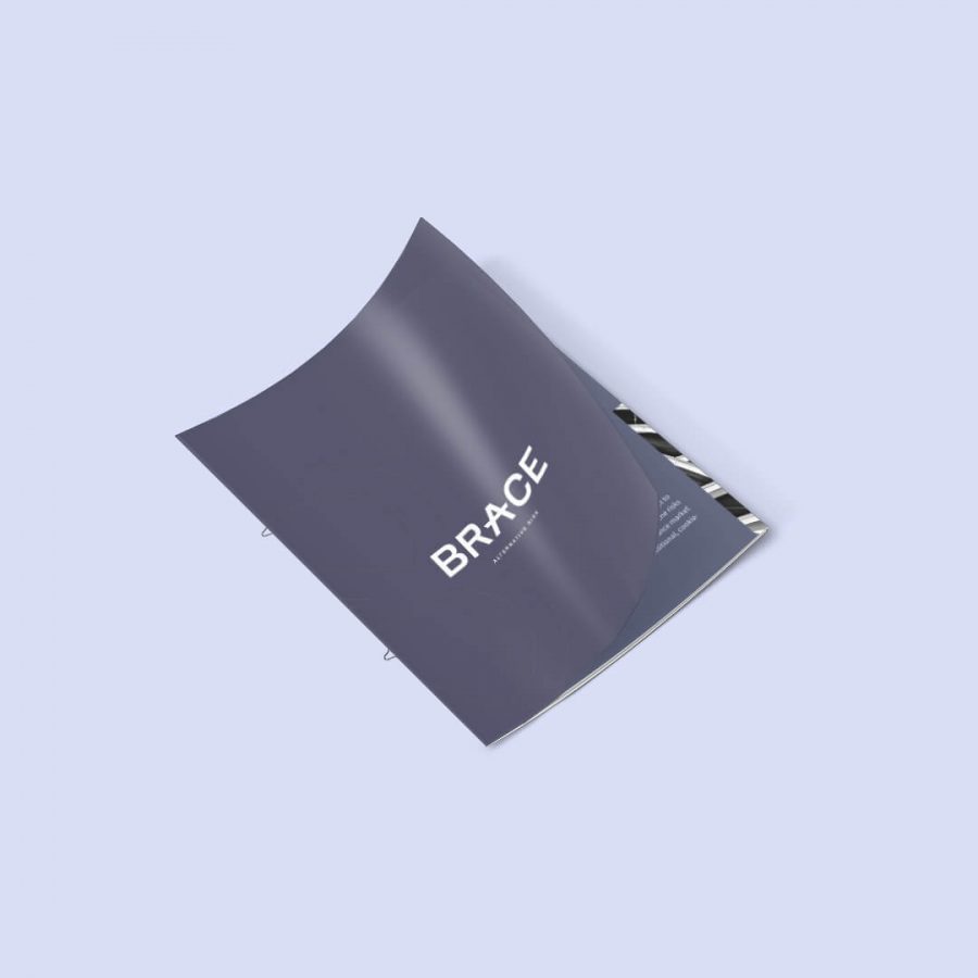
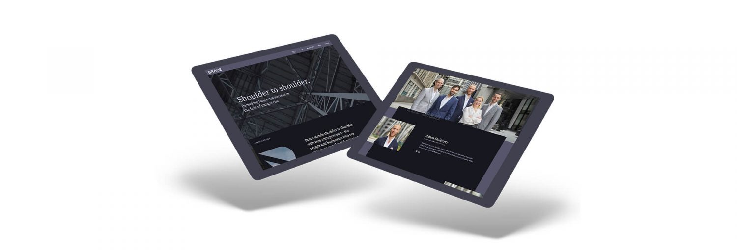
The final outcome was a bespoke website that communicates all their key messages. Supported by a brochure to provide to all their clients and provide a more in-depth outlook of the service offerings they can provide.

From our research, we could see the opportunity in the market to launch a disruptor brand, and started work with a team of creatives to test creative which stood out but not too much that we alienated clients in an industry heavily reliant on trust and credibility.

This led us to a cutting edge dark purple and black colour palette with complimenting imagery of strong harsh structures and textures and challenging landscapes – communicating the element of risk and adventure and a challenge.

Brand Guideline Development

This process allows for a consistent brand style to be replicated across all assets. Whether that’s across the website, social channels, or print documents.

This can include anything from a set colour palette, fonts, logo positioning, to the style of imagery used. In this instance, the use of buildings and structures, supported by the addition of some adventure and risk themed imagery is stipulated. This form of imagery stands out compared to Brace’s competitors whilst embodying some core aspects of the brand.

Other Work

View all work

Ready for outstanding?

Work with us
Chat to us