Coryton

Rebranding Coryton

Overview

Coryton advanced fuels needed to change the way it was perceived. The brand had been rooted in an outdated version of the company that doesn’t exist and no longer accurately represented what they do. Coryton had become synonymous with images of refineries, which in today’s climate carried negative connotations linked to pollution. We needed to refresh the brand to take Coryton away from the old cliches and tell the story of today’s Coryton.

The challenge was to identify a new brand position, purpose and idea that reflected the Coryton of today and the Coryton of tomorrow. A strategy that would inform a new visual identity and tone of voice that would represent Coryton at every touchpoint. One that told a story of a business that is proud of their role in creating a more sustainable future for everyone by producing the highest quality bespoke blended fuels that reduce emissions.
Services

  • Brand Strategy & Experience
  • Identity Design
  • UX/UI Design
  • Web Development
  • Web Design
  • Photography

Firstly, we used our agency challenger model to hand pick a set of specialists with the key skills to deliver outstanding outcomes for Coryton. Working collaboratively with Coryton’s senior leadership, to conduct research with clients, suppliers and industry influencers, who supplied insight that helped us understand what Coryton meant to them.

Alongside brand planning methodologies, it allowed us to develop the Coryton brand. We were able to truly understand the reason why Coryton exists and the underlying essence of what makes it relevant and necessary to its customers. This informed the brand idea, ‘For a Cleaner Future’.

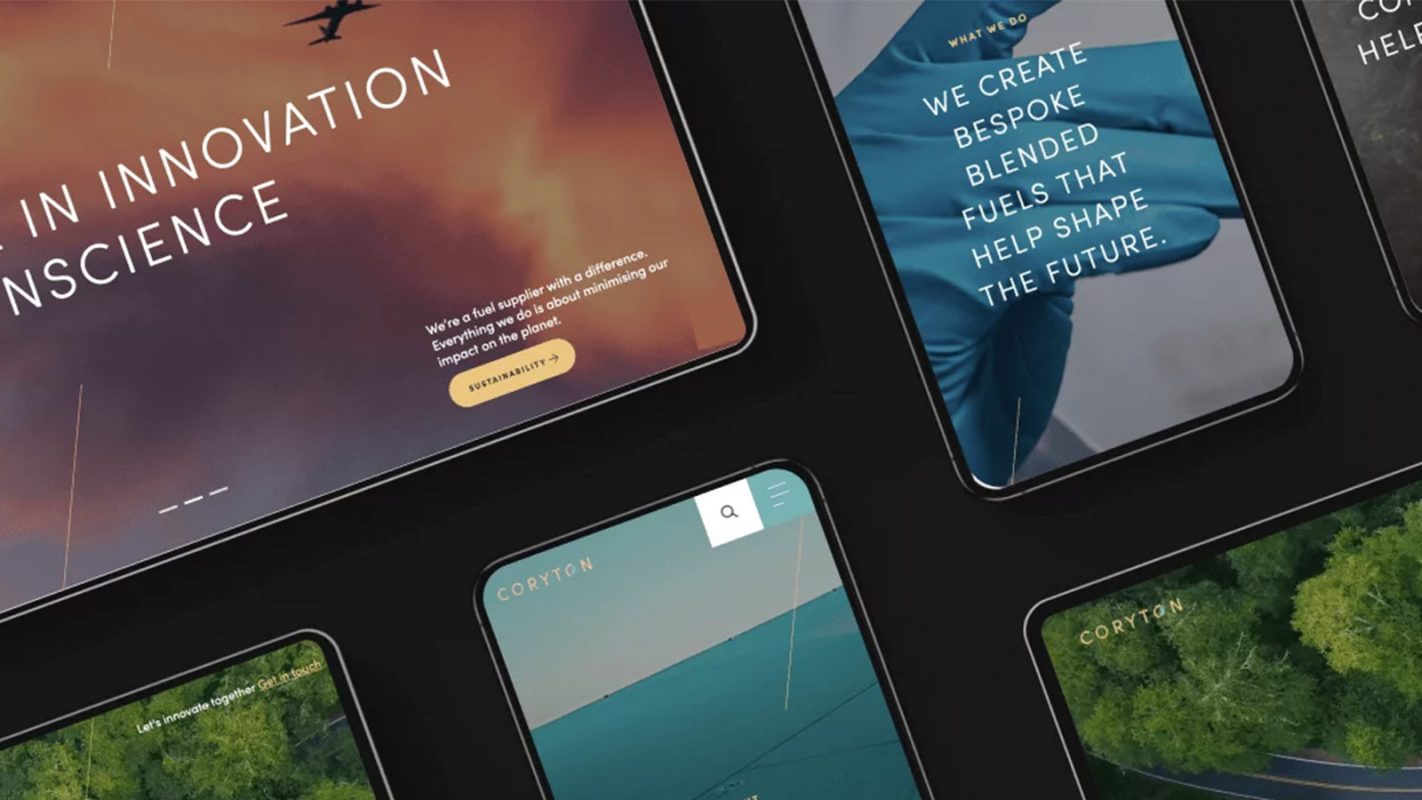
Our objectives on brand strategy/architecture, visual identity and language, were now being bought to life in a front-facing digital experience through re-build of the Coryton website.

Coryton - On SIte
Coryton Tanker
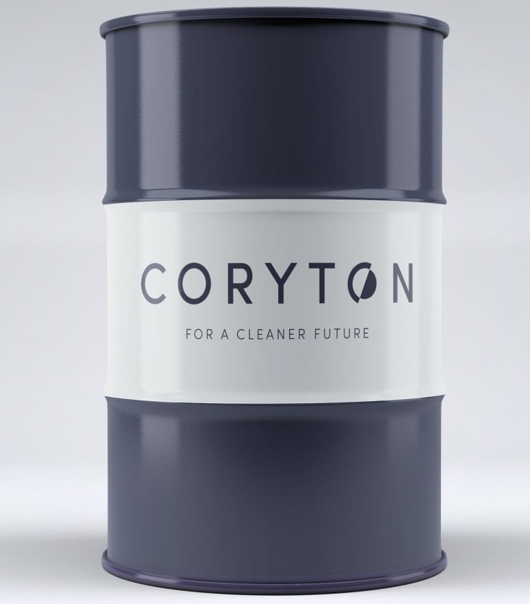
Coryton - Oil Drum

A brand which the business is proud of, and a brand which represents its future.

A stunning visual identity and strong tone of voice which has been brought to life on the website, that reflects the outstanding outcomes achieved in our challenger model, and the collaborative effort of all involved.

We’ve established an outstanding relationship with Coryton based on trust to deliver excellent work, on time without fuss and for great value.

Logo

The Coryton logo is comprised of two core elements, the Coryton ‘C’ and the globe. This icon represents energy, future and sustainability and this is emphasised with the key brand messaging and tagline ‘For a cleaner future’.

Taken out of the context of the logo the Coryton icon can be used to add pattern and texture to visual communications.

The icon in the logo is tilted at 23.5°. We use this angle to draw a diagonal line that is used in a number of ways throughout the brand communications.

Iconography

Icons are used to describe emotive elements of the brand such as highlighting the brand values expertise, innovation and sustainability. They are also used to describe more functional elements of the brand such as divisions e.g. transport, aviation and research.

The icons are primarily constructed from elements of the logo. They use a combination of circles and angular lines to form the shapes.

“We chose Perfect Storm based on reputation within my network of contacts and the strong pitch they put together. They have not disappointed, presenting innovative ideas and high quality designs that more than deliver the brief – on time, on budget and output that has left us feeling we have obtained exceptional added value.”

Andrew Wilson - CEO

Other Work

View all work

Ready for outstanding?

Work with us
Chat to us