Purpose

Rebranding Purpose

Overview

Purpose is a commercial property company. Working in London and focussing on identifying and transforming buildings in disrepair in areas like Bethnal Green and Tottenham. Areas that are going through significant change and are very popular to live and play in for the younger working professionals.

For the past five years Purpose have been successfully filling these buildings with small to medium businesses, often from creative industries who are looking for blank spaces that they can turn into art studios, radio stations, light industry ventures, tech start-ups and digital agencies.

However, they had not built a brand and digital experience that reflected the brands position and identity or indeed identified a marketing and communications strategy to achieve the growth they wanted.

Services

  • Brand Strategy & Experience
  • Identity Design

We started with brand strategy, immersing ourselves in the brand with key stakeholders, and interviewing a broad range of tenants. As we worked through brand building methodologies, we created the brand idea ‘Transforming spaces for growing businesses’

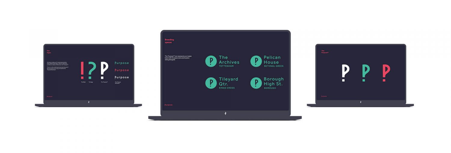
Using the archetypes exercise, we supplemented the strategic work with guidance on personality, visual identity and tone of voice all helping to inform the brief. Purpose needed a brand that was able to flex between two key archetypes. Simplifying these two archetypes into a single visual, led us to the question mark and the exclamation mark.

They question mark represents thought, consideration and knowledge. The exclamation represents energy, vibrancy and bravery. Fused together this became the ‘P’ icon for the Purpose brand. Striking as an icon, functional as a full logo lockup and flexible enough to become the building blocks of the visual identity, across both print and digital platforms.

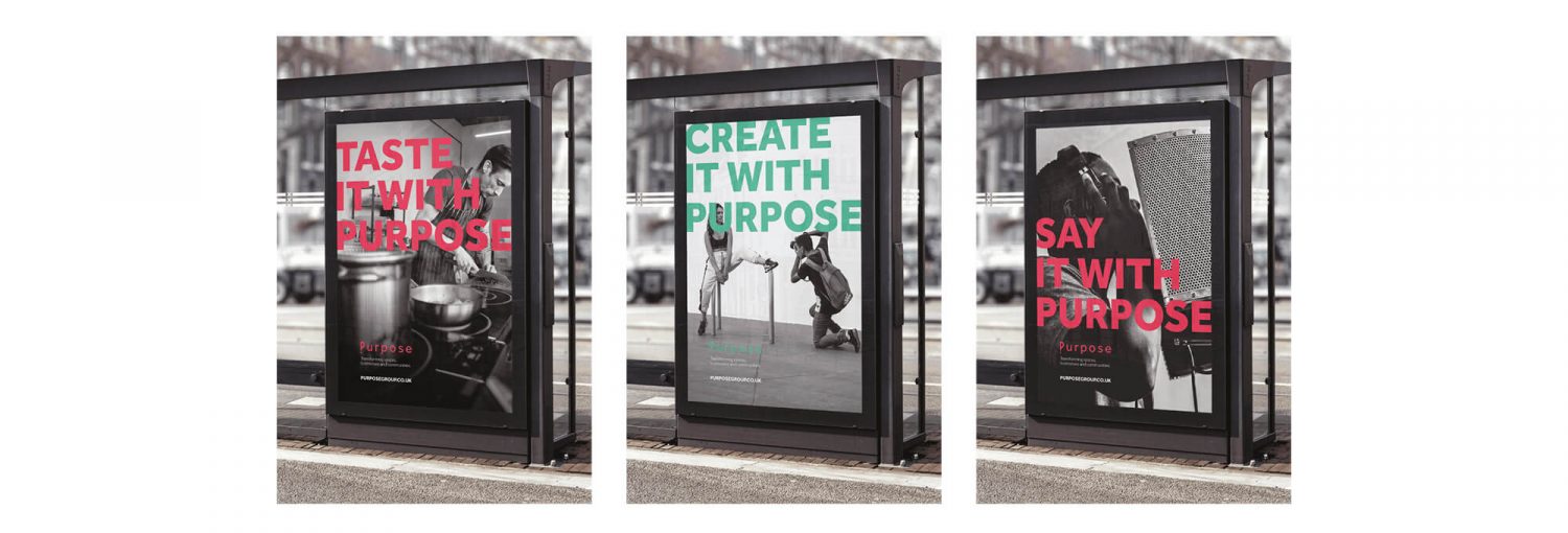
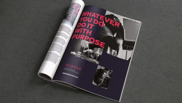
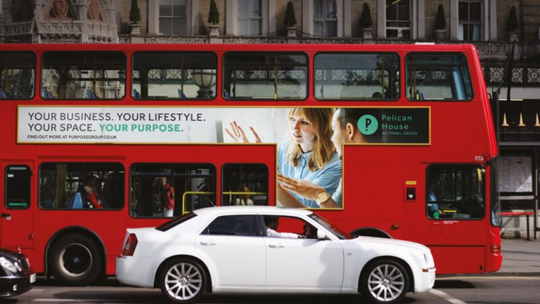
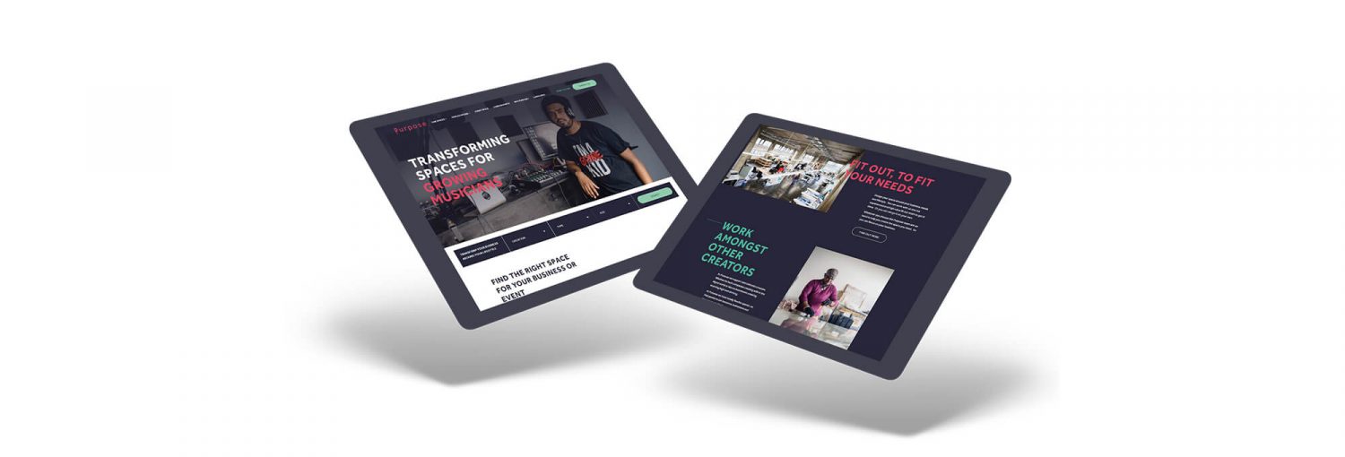
This led to a striking, stand out brand in what is a notoriously dull space. Transforming the how users experience and engage with the brand both physically and digitally. The bold palette, striking typography and honest ‘real’ imagery were able to tell multiple stories from one singular brand platform and deliver a range of communications that reflect Purpose’s ‘reason for being’ and that of their partners. Bringing to life the amazing people and business at Purpose.

Other Work

View all work

Ready for outstanding?

Work with us
Chat to us